
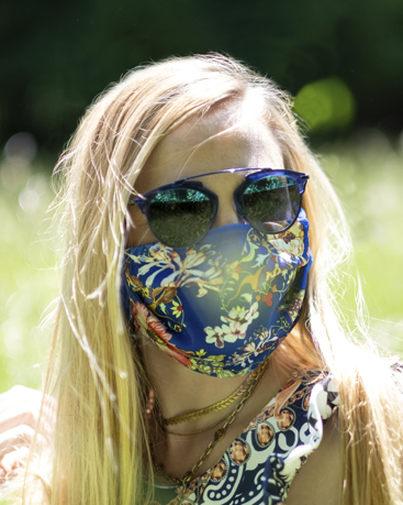
The key colors of this look is the combination of the complementary colors yellow and blue which give the outfit an extraordinary touch and make it look different. The perfect styling for bright summer days! I chose two of the Pantone trend colors for this summer:

First of all a maritime-inspired blue, which could also be called Snorkel Blue. It plays in the navy family, but with a happier and more energetic context. Pantone chose the name because the color should remind of relaxing vacations and encourages escapes. It is supposed to be striking, with lots of activity bursting from its undertones.

The second color that offer the complementary contrast is the majority one of the spring/summer palette trends toward calmness. Pantone chose the name buttercup which is a pretty good description for this color because designers reveal a shining beacon this season to transport its wearer to a happier, sunnier place.


Streetstyle shooting at a wonderful sunny and warm summer morning with the photographer Milos Nenkovic. The photos were taken at the bridge in “Großhesselohe” near the Isar river.
Follow Us On
Did you like this blog entry? I hope you enjoyed this post, check in next week for more tips or have a look at my other posts. Please feel free to share them and to leave a comment or to follow me on Instagram or Facebook. On Instagram you also will find simple snapshots of my daily life taken with my cellphone besides professional photography and fashion themes.
See you soon, XOXO


Hinterlasse einen Kommentar