Dreamy, milky and soft, pastels aren’t just for little girls anymore. Pastels have grown up and become sophisticated. I am absolutely in love with the Pantone’s colors of the year 2016 “Rose Quartz” and “Serenity” which gentle tones have already made their way into fashion, cosmetics, graphic design, etc. They remind me of flushed cheeks, enchanted bloomings and serene sunsets during lighthearted spring days and provide us with a naturally connected sense of space. The colors bring a calming effect even in turbulent times and a sense of composure. For a wider range of weightless and airy pastels expand your palette with the colors yellow, orchid or peach.
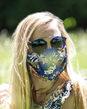
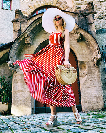
Streetstyle fashion shooting with the photographer Judith Stoop.
Follow Us On
Did you like this blog entry? I hope you enjoyed this post, check in next week for more tips or have a look at my other posts. Please feel free to share them and to leave a comment. You can subscribe to my website or follow me on Instagram or Facebook. On Instagram you also will find simple snapshots of my daily life taken with my cellphone besides professional photography and fashion themes.
See you soon, XOXO





Hinterlasse einen Kommentar