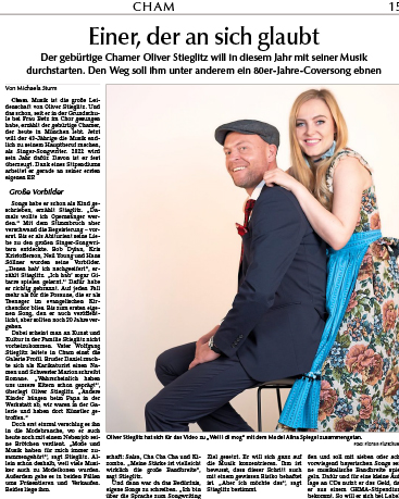
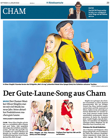
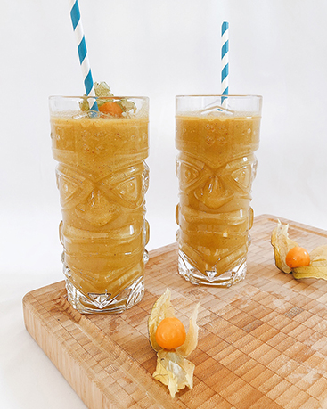
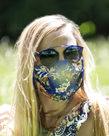
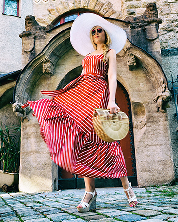
Bold & vibrant colors trend in 2016
…and one of the trends in 2016 is going bold. The main elements are vibrant and bold colors that fit in with the 80s/90s retro trend. Retro-inspired palettes with popping bright colors bring a lot of energy to your creative project. Vivid and bright colors represent excitement and optimism. Of course the Pantone color palette of spring 2016 falls right in line with this trend, but remember: This fearless color palette is not for everyone!
Many designers use vibrant, bold colors this season and come up with unexpected color combinations. Especially red, orange, pink, bright green, blue and purple have become the key colors. The result is a beautiful rainbow of bright, energetic and fun colors.
The inspiration from this trend comes from urban architecture, travel, nature and art.


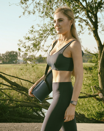
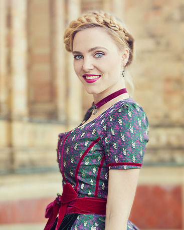
Streetstyle fashion shooting with the photographer Judith Stoop.
Follow Us On
Did you like this blog entry? I hope you enjoyed this post, check in next week for more tips or have a look at my other posts. Please feel free to share them and to leave a comment. You can subscribe to my website or follow me on Instagram or Facebook. On Instagram you also will find simple snapshots of my daily life taken with my cellphone besides professional photography and fashion themes.
See you soon, XOXO


Hinterlasse einen Kommentar